The tale of our home renovation: part 5
Brace your selves, today I'm going to show you before and after pictures of our upstairs bathroom, and they are not pretty! These pictures will give you even more of an idea of the sorry state of things when we bought the house, and total lack of aesthetic care that had been put into it. The whole top floor, where our bedrooms and bathroom now are, had a drop ceiling (like you see in office buildings), dark wood paneling and linoleum. All of that had to be gutted, we actually hired a demolition crew to come in and take it all out. After the demolition we decided to make the bathroom bigger than it was before, as you will see in this "before" picture, the sink comes way out into the room...
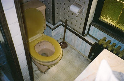
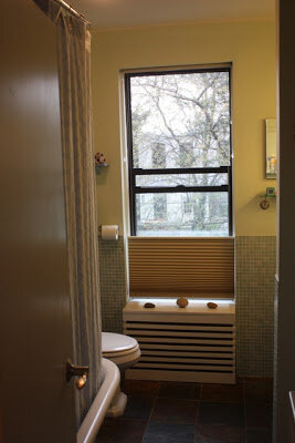 We added a claw foot tub (I'm a sucker for those) and shower, on the left as you enter the room. This "before" picture of the toilet area is pretty scary, I apologize, but now you know what we were dealing with!
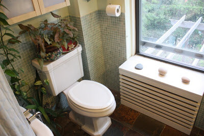 Frank made that beautiful slatted radiator cover, and I continued the turquoise tile theme with a small light blue glass tile all around the lower half of this room. I absolutely love this tile, it makes the room feel spa-like to me. I also chose a large slate tile for the bathroom floor that feels good under foot. In the next picture you can see how we bumped out the room to make a space for the sink.
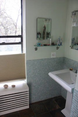 Along the same wall as the sink we added a storage area with lots of built in shelving, along with space for a stacked washer/dryer. I can't tell you how much of a luxury it is in NYC to have a washer/dryer at home. Most people have to take their clothes to a laundry mat. After years of apartment living in my twenties, I still feel so lucky whenever I am just able to throw the kid's clothes right in the washing machine in our own bathroom!
 In the next part of the tale of our home renovation I'll show you more of the upstairs. I hope that your week is off to a good start!
 We added a claw foot tub (I'm a sucker for those) and shower, on the left as you enter the room. This "before" picture of the toilet area is pretty scary, I apologize, but now you know what we were dealing with!
 Frank made that beautiful slatted radiator cover, and I continued the turquoise tile theme with a small light blue glass tile all around the lower half of this room. I absolutely love this tile, it makes the room feel spa-like to me. I also chose a large slate tile for the bathroom floor that feels good under foot. In the next picture you can see how we bumped out the room to make a space for the sink.
 Along the same wall as the sink we added a storage area with lots of built in shelving, along with space for a stacked washer/dryer. I can't tell you how much of a luxury it is in NYC to have a washer/dryer at home. Most people have to take their clothes to a laundry mat. After years of apartment living in my twenties, I still feel so lucky whenever I am just able to throw the kid's clothes right in the washing machine in our own bathroom!
 In the next part of the tale of our home renovation I'll show you more of the upstairs. I hope that your week is off to a good start!

