Before and After: the master bedroom
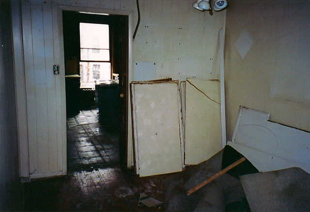
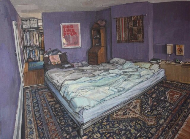
The "before" shots of our bedroom are confusing, because to create all of our bedrooms we gutted out all of the walls on the top floor of our house, and then reconfigured the whole space. In the top photo you are looking through to where the kids room now is, from my last post. Where that door way is we put a wall and added our walk-in closet (one of my favorite additions to the house!), and then behind that our bedroom. Here is Frank's recently finished painting of our bedroom, he posted about it on his blog here,
You can see the back wall of our bedroom with the closet beyond that, so the painting is a good "after" shot from the same view as the first picture. During the staging of our house as we've been getting it ready to go on the market, our realtor asked us to reconfigure our bedroom furniture, to make it feel like more of an "oasis"
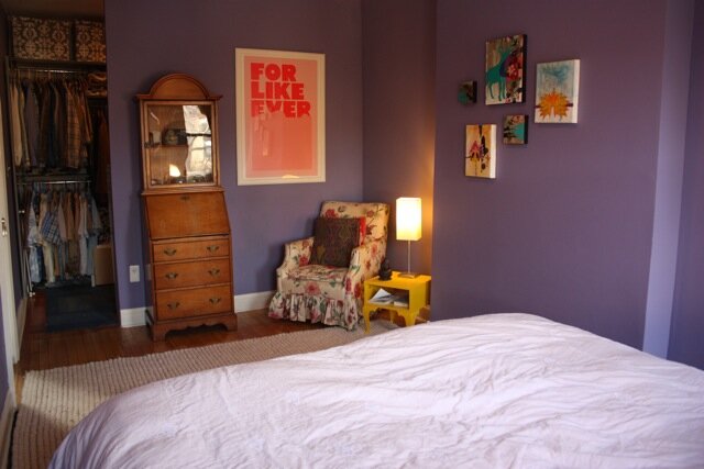
Here's what the staged version looks like now,
One of the ideas that our realtor is really trying to use for our house is that you can live in a civilized way with kids (I really can't write that without smiling), and part of that was making the master bedroom feel really inviting, like you just want to fall into the bed. They asked us to get all white sheets, to make our bed feel "cloud like". Now, after having the all white sheets for a few weeks I am in love with it, it feels so clean and inviting, and makes the space feels more streamlined and relaxing.
Next up in the before and after series, will be the playroom on the garden level of our house.


